I am designing a parent portal page I hope to use for our school website. Students, parents, staff, and teachers would be able to access this website multiple times a week to see student grades, classroom news, calendar events, and contact the teacher(s).
I interviewed one parent who is not a staff member or teacher, one parent who is also a teacher, two parents who are also staff members, and two students. My interview questions would change depending on answers given, but in general they were as follows: Do you currently use a parent portal? If yes:
Four out of six interviewees use a parent portal. They use it a few times a month and appreciate the information it provides such as the calendar and grade updates. They do not like how often it is updated. One interviewee said that there is not a lot of consistency – some teachers put in grades often, but some only put in grades at the end of the quarter. It was suggested that there be some kind of blog about the classroom, as well as a way to connect with the teacher directly from the portal page instead of just email. They all thought the layout of the portals was “boring.” They thought the parent portals could be more useful if it was updated regularly and all the teachers and staff used it the same way.
Two of six interviewees do not use a parent portal. One is a parent, and a parent portal is not provided at the school their child attends. They think it would be highly useful to be able to check on grades, see a school calendar, and interact with teachers through a portal. The other is a student and also does not attend a school which provided a parent portal. They also mostly like the idea, especially so they could see missing assignments, but are hesitant about their parents seeing that part!
The interviews gave me many ideas I had not considered for my website previously, such as a Teacher Blog. A Teacher Blog would provide insight into classroom happenings, celebrate classroom successes, encourage and promote classroom events, and give parents and students both a way to comment on, ask questions, and make suggestions in a more casual format.
Most of those interviewed expressed concern at how often the grades were updated, and the consistency of these updates across different classes. With administrative training and oversight, grades will updated at least weekly so parents and students are able to see how they are doing in classes and if any assignments are missing. This would also benefit students who have been absent, so they can see what work they need to make up.
At schools, especially middle and high schools with multiple classes, it is often difficult to keep up with all of the events. An integrated calendar would help students, parents, and even teachers and other staff members keep track of day-to-day matters. These matters can include assignment due dates, school assemblies, sports events, and major holidays or days off.
My target audience includes parents, teachers, school staff, and students of all ages. If they attend the school, they will be able to access the website with a user login and password. Parents and students will be shown how to access the website at an open-house night at the school. Teachers and school staff will have training on accessing and updating their portions of the websites.
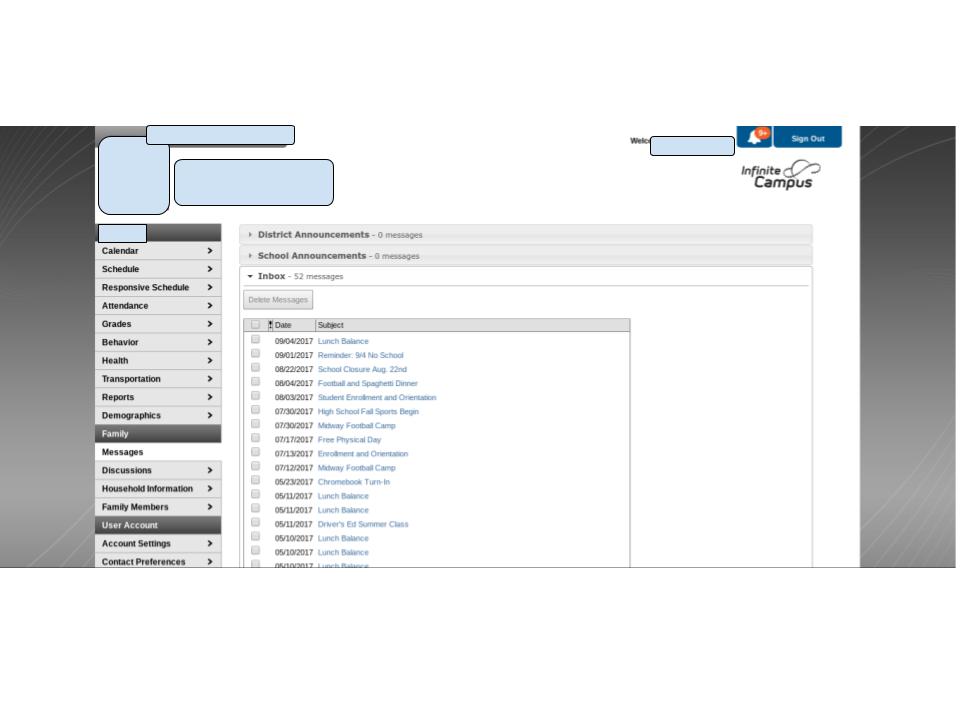
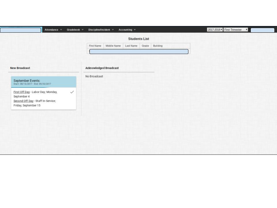
Two parent portal pages I have been able to log in and reference provide a bit of insight as to what the interviewees meant when they said “boring” or “not easy to navigate.” I have provided screen shots of them below, as logging in requires a username and password. They also show how often the teachers update the grades. When I first visited the websites, it looked as thought it had been recently updated with a grade from a teacher. Upon subsequent visits to get a better feel for the site, it is clear that it is not updated with regular frequency. Both websites are done in shades of muted grays and blues, which makes it easy on the eyes, but not very exciting. The navigation bar being at the very top of the screen is also a bit confusing to navigate, while the other website’s navigation bar is very busy and tries to put too much information in that one space.
This school’s website has a link dedicated to school events. I have chosen the calendar to look at. The school year calendar with important dates is available to download, which is handy, but the monthly calendar on the website itself is barren and has not been updated fully. It is not interactive, and looks a little faded, which makes it a strain on the eyes.
This school’s website also has a calendar page. It includes a general overview calendar for the district, plus links to program-specific calendars.
For my website’s calendar, there will be a general calendar on the main site, but once someone logs in, their calendar will be personalized. They will see assignment due dates, conference times, and may even add their own events to it.
This school’s website has a link for school staff. It provides phone numbers and email links for each staff member. It looks like it should have a picture of the staff member, as well, but they are all grayed out. The phone numbers and email link are very helpful for contacting teachers in an official capacity, and my website will include similar contact information. My website will also include a Teacher Blog, and parents/students/staff will be able to comment/suggest/question on that, as well, but in a more casual setting.
The content of my site will be available after a member logs in. The landing page will be student information. The navigation bar will be to the left side of the screen. Each navigation link will take users to a new page (with the same navigation bar on the side). The content will include Grades, Teacher Blog, Teacher Contact, School News, and Calendar.
I have chosen to organize this information based on what the interviewees viewed as most important to them. They primarily checked the site for grades, so grades will be the first on the navigation after “home.” Subsequent links are in order of perceived importance to the target audience. The landing page has the most recent pertinent information on it, and will link to their respective pages so there are many convenient ways to get to whatever information the user requires.
Media content will include the school’s logo, pictures of teachers and students, and photographs of the school and school activities. All media is naturally copyright of the school and free for use in school publications including the website.
The color scheme of the website will be in shades of blues, grays, and white. Royal blue and white are the school’s color, and gray will provide an appropriate transition between the two bolder colors.